
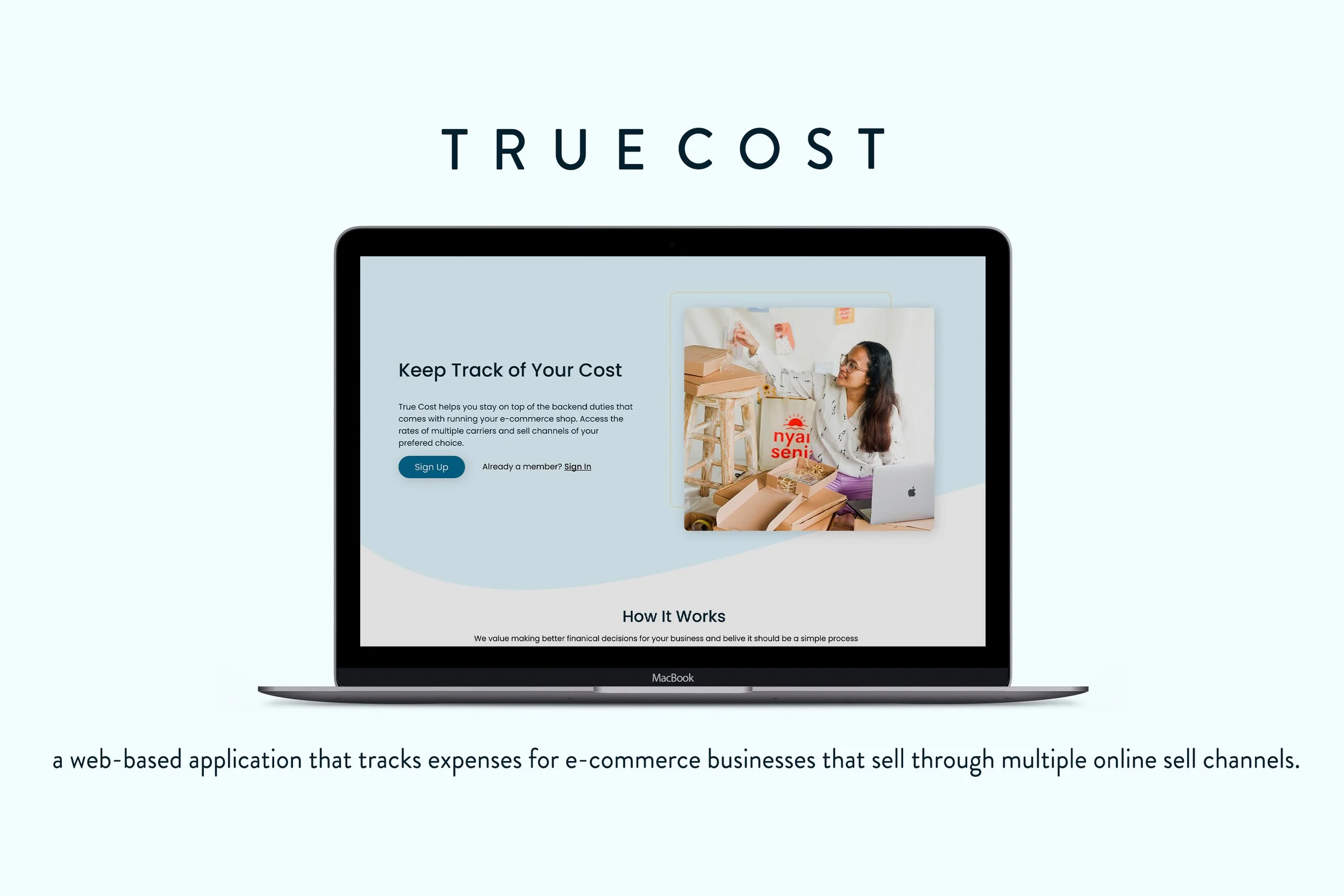
ROLE: UX/UI Designer with three other designers selected to create a web application.
TEAM: Christian Bistany, Marwa Sadd, Caroline Hall
TOOLS: Figma
OVERVIEW: Web-based application that tracks expenses for e-commerce business owners that who through multiple online sell channels.
INSPIRATION
Meeting our Client
True Cost is a web application concept and idea created by Erica Thomas. Our client owns multiple businesses and sells products online. Her main needs were concerning the backend of running an e-commerce store. She expressed how difficult it is to know how much she has to pay to sell items across marketplaces like Etsy, Amazon, Shopify since their rates are constantly changing. Her feelings about this extended to her experience with shipping carriers also.
Goals and Needs
Our client provided us with a great deal of insight that steered us in the direction to learn about e-commerce business management, some of what we covered:

Tracking user expenses who sell through multiple online sell channels like Etsy, Amazon, eBay, etc.
An easy way to view inventory, shipping, and selling channel rates as well as hidden/non-hidden fees that come with selling products.
Taking steps towards better financial decisions will help shop owners save money by knowing where their money is being spent.
RESEARCH
Finding Influence and Users
Since we were unaware of what shop owners do in terms of organization, marketplace connectivity, shipping cost, and fees; we tackled finding companies that offer a service similar to Erica’s needs.
COMPETITORS
What we pulled from our competitors
Onboarding is key to enable users to create a personalized experience by knowing why they are using their services and how.
Import and sync options for multiple carriers and sellers to have inventory, shipping, and order information in one place.
An inventory page of tables and/or a dashboard is needed to show users an overview of input.
Displays of revenue, item popularity, an overview of item improvement, carrier fees, and rates of linked accounts
USER INTERVIEWS
Finding users to interview was an initial challenge for us since this market is specific, most people are consumers but not store owners.
Our conversations with users were conducted to understand how users run their business online and what issues they faced with shipment and platform management.
We wanted to know:
The issues and problems they face while managing their businesses on the backbend.
How and where shop owners sell their products, and how frequent they sell.
The type of systems they may or may not use to track their inventory and sales, and overall managing of their business.
QUOTES FROM USERS
“I need a way to view and understand the platform I sell on."
"I appreciate viewing the full breakdown of sales and how my profit is being spread."
“I want to know how my shipping habits affect my business finically."
Collecting the results of our interviews allowed us to understand how users feel on a larger scale about their business. Many of our findings and insights supported the basis of our clients needs.
ANALYSIS
We took note of how users felt during our conversations with them. We analyzed our interviews and zeroed in on what stood out within our findings. This included the use of time, trends, applications, preferences, and cost objectives.
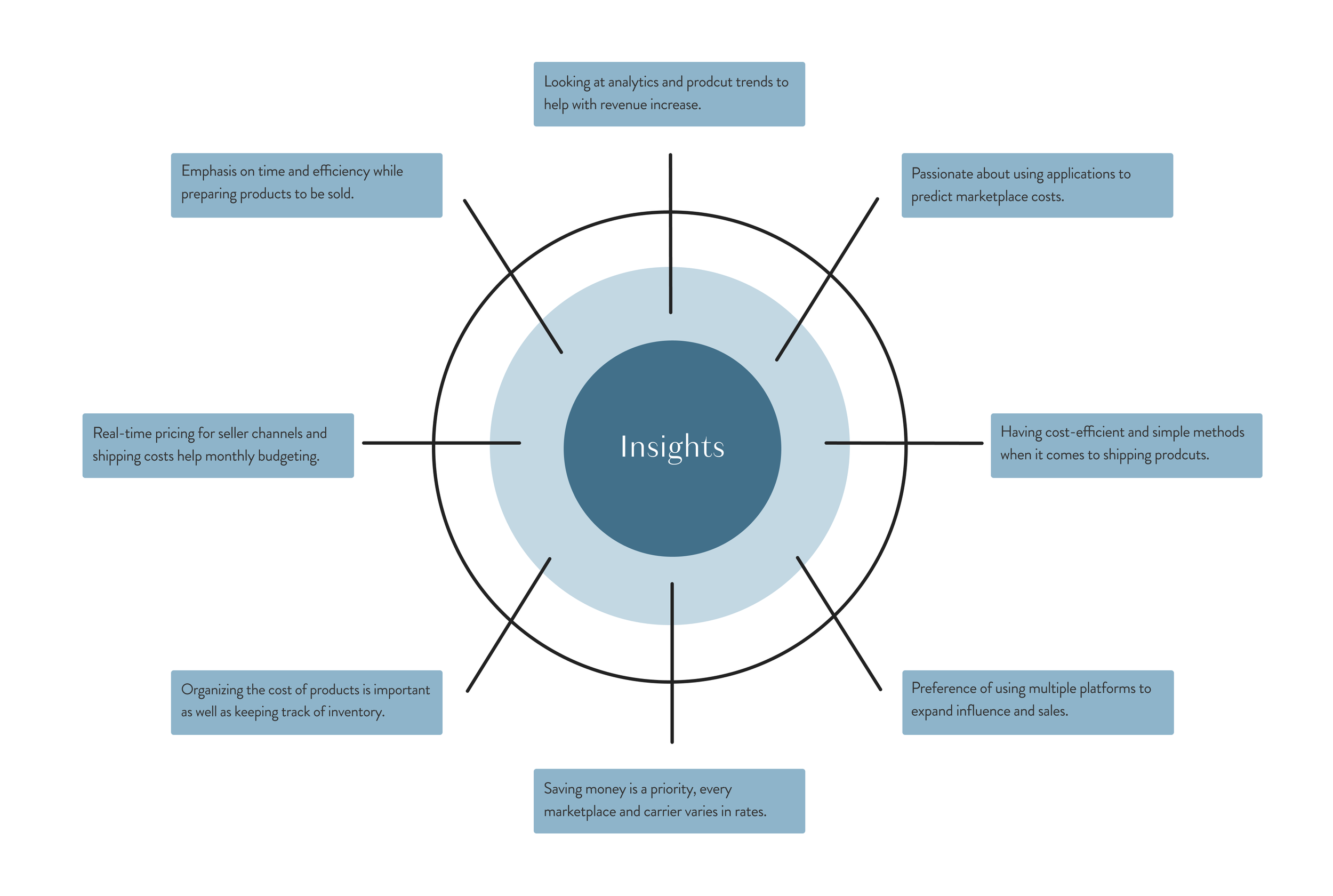
We observed that users want to save money in a multitude of ways while selling products. Users are interested in a simplistic way to manage their shipping orders as well as compare the costs of shipping and platform fees. While understanding the needs of the users we spoke to, the insights we gained allowed us to find the main problem to design a solution for.
FINDING THE MAIN ISSUE FROM OUR RESEARCH
THE PROBLEM
Users need a way to track platform fees, shipping cost, and revenue to maximize profit margins and increase the efficiency of their businesses.
UI CONCEPT AND SOLUTIONS
Providing users with the ability to organize and compare the costs of marketplace channels, shipping carrier rates, and inventory is the experience we aimed to create. The user flow was developed from our competitive analysis findings and sketches.
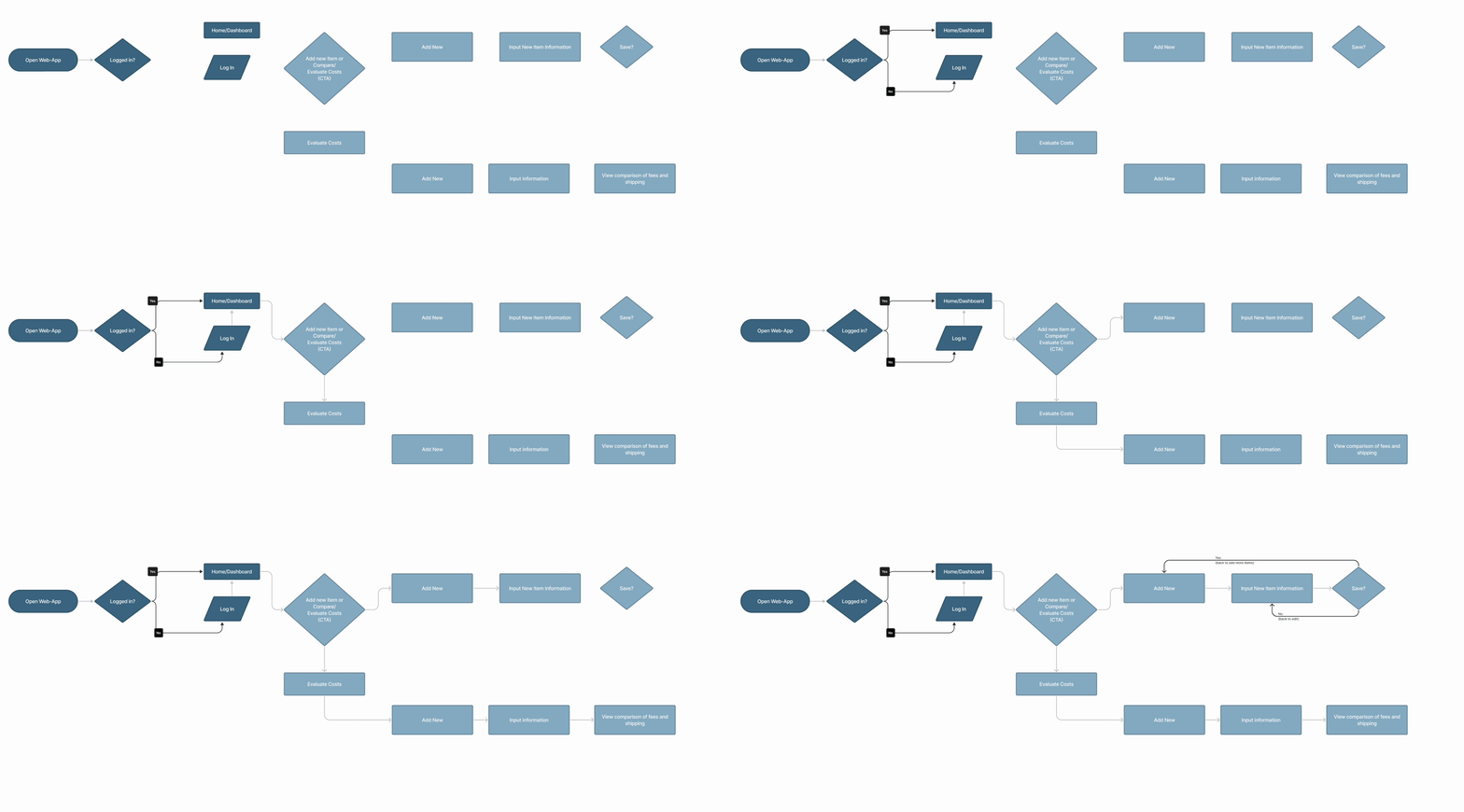
We took note of our competitors, client needs, insights, and findings of our interviews to develop the pages of True Cost. The content of the pages included a dashboard, onboarding phase, as well as a comparison page for shipping and marketplace sellers. We began the UI phase of this project by making simplistic designs to test with users.
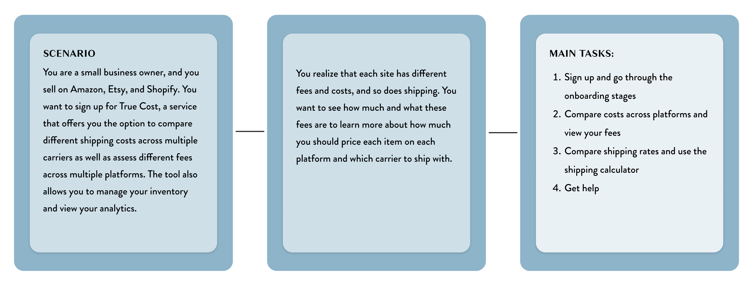
TASK SCENARIO FOR USABLITY
We conducted a total of twenty usability tests throughout the design process to see if users could understand the user flow and navigate through the design while we took note of where users found themselves questioning parts of the design for context and usability.
DESIGN ITERATIONS BASED ON USABLITY TESTS
LANDING PAGE
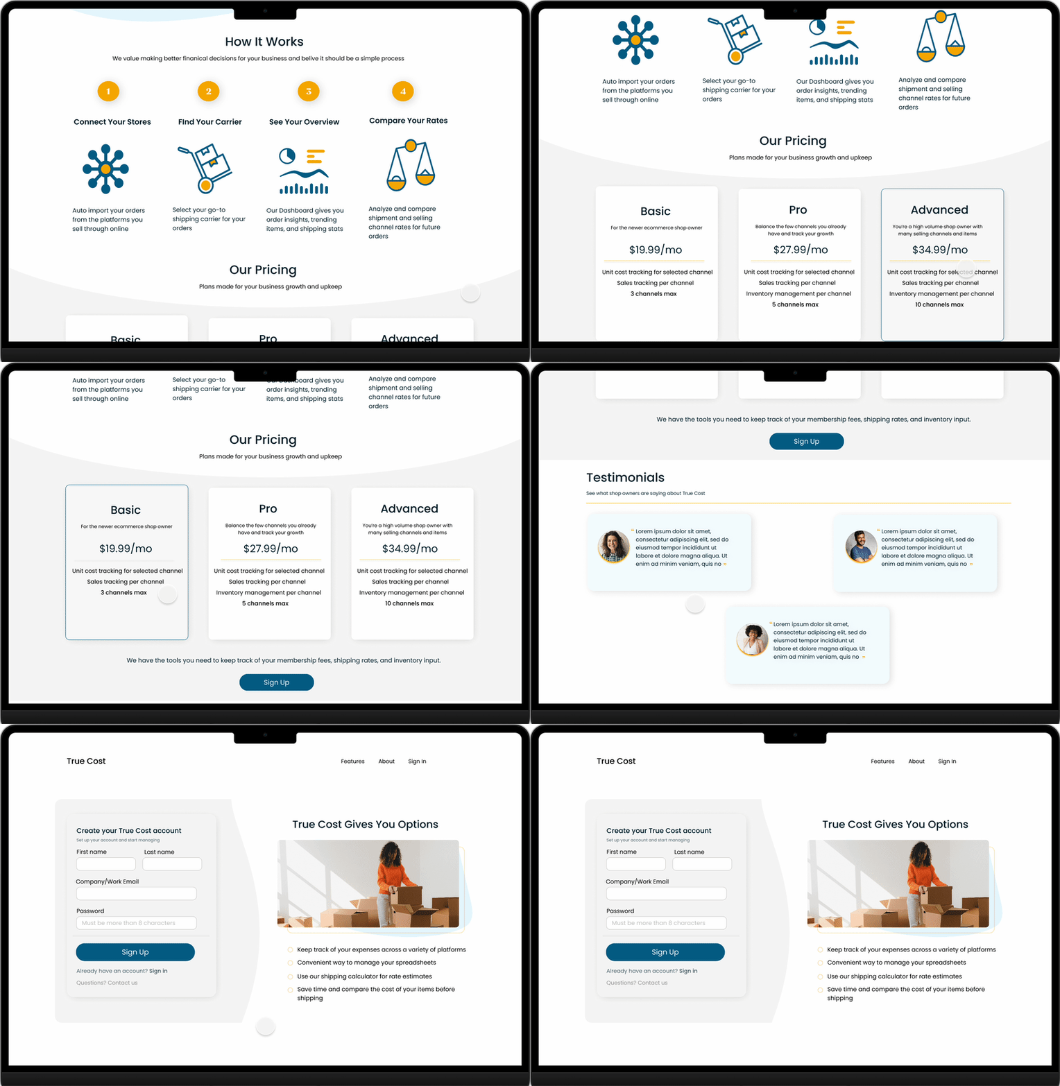
Users wanted to know what True Cost is before signing up. We added a landing page to provide information about the service to get users interested and engaged before the onboarding process.
USER QUOUTE
“I’m curious if there is somewhere I would get information about the service before I sign up? I feel like I am committing to something I don’t even know.”
AT GLANCE COMPARISON
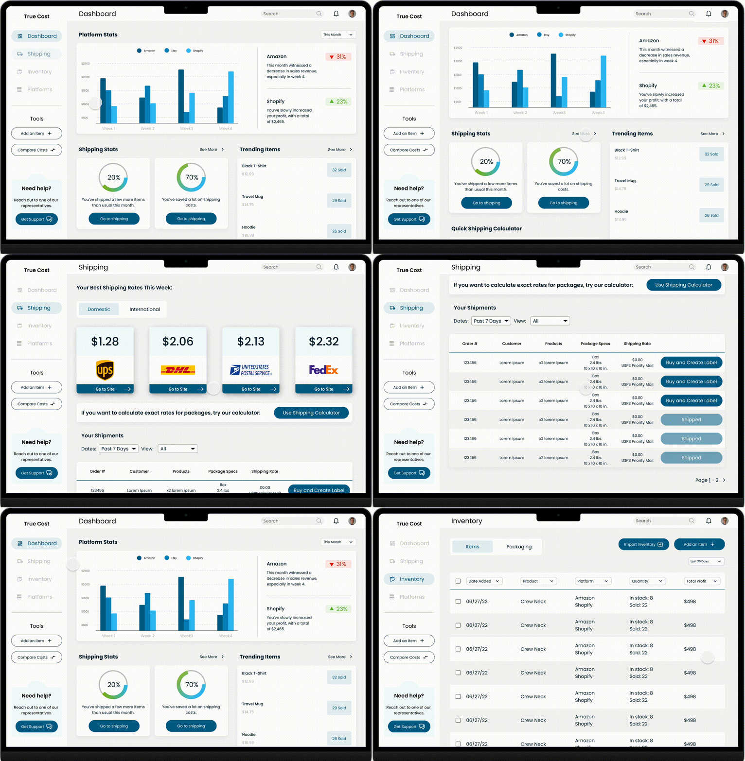
There was a great deal of information displayed on our comparison pages as well as the dashboard, we added pages containing a brief overview of content before having the option to view a detailed breakdown.
USER QUOTE
“The fees breakdown table seems overwhelming. Would I always need to see that information after logging in? ”
UI WRITING
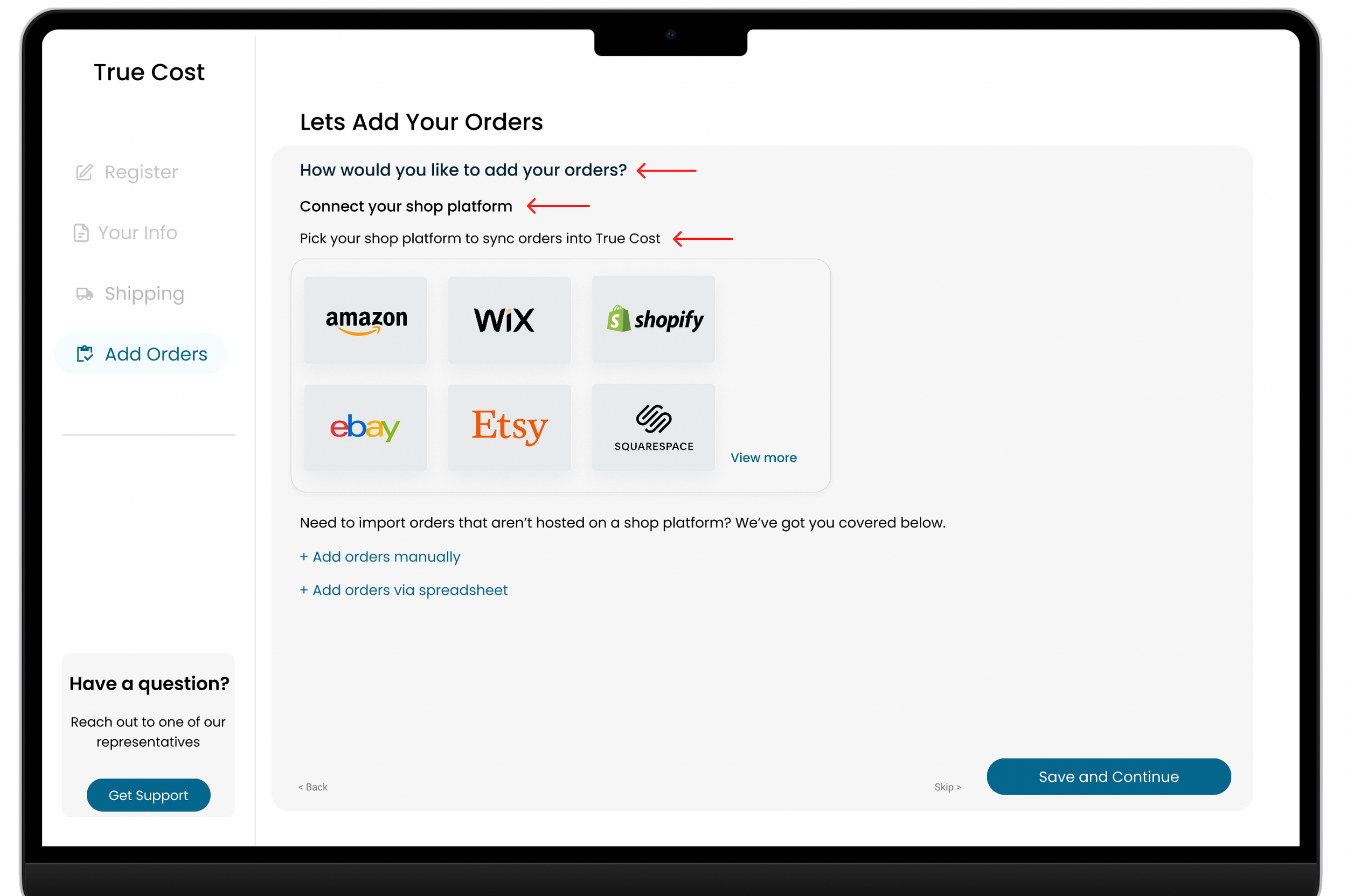
Users were confused about the text within our design, they pointed out some of the text lacking context within the onboarding process as well as some of the buttons/toggles that direct them to compare and add items. We edited much of the text to establish clarity through the application
USER QUOTE
“Let’s Add Your Orders,” what does orders mean in this context?”
UI PROTOTYPE
CONCLUSION
Final Thoughts and Next Steps
The overall process of making this application provided me with confidence in learning to understand user needs as well as client ideas - we figured out a way to support our client and make something that could be beneficial if developed.
We gave our client an estimate of what True Cost might look like when developed and the time frame.
Our client was beyond satisfied with the outcome of the design and expressed how we understood pain points, communication between client and designer, and provider her with more than enough information to help True Cost become a public web application.