
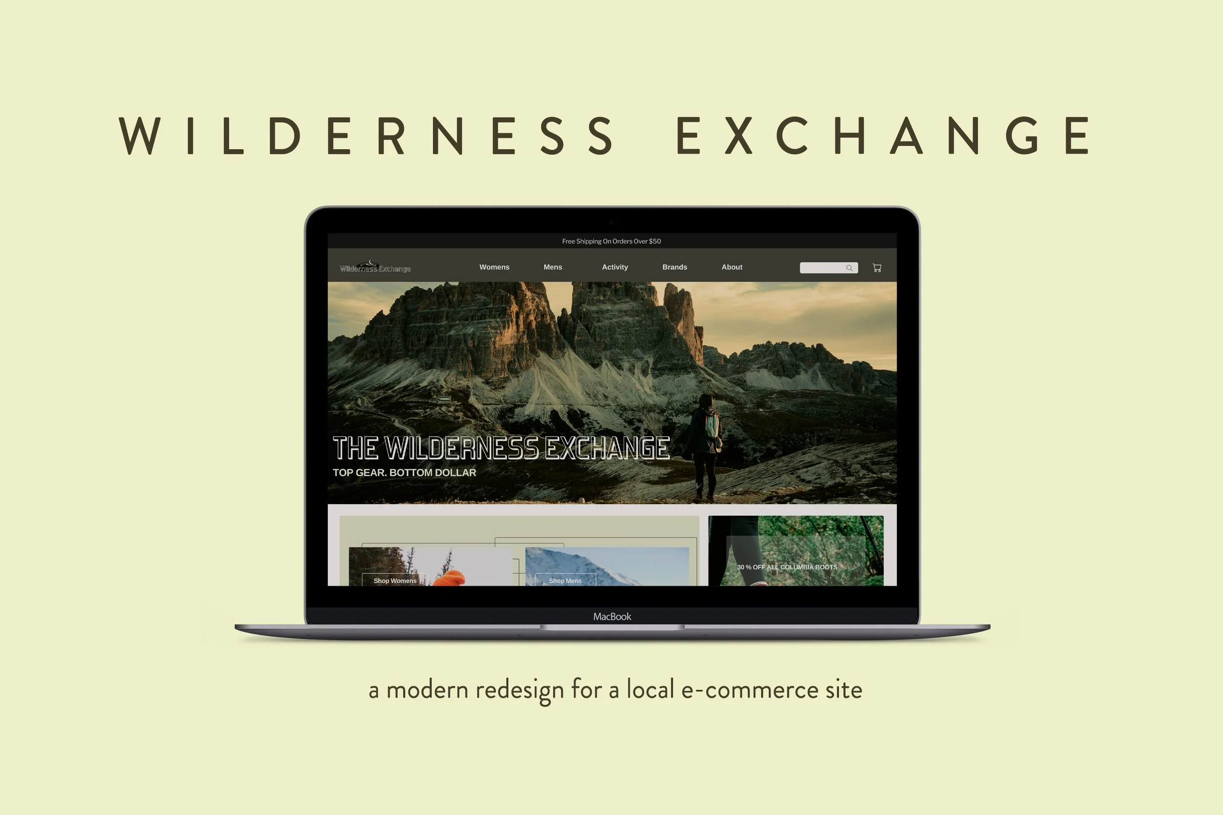
ROLE: UX/UI designer for website re-design
TOOLS: Procreate/Figma/Photoshop
OVERVIEW:I created a new website for Wilderness Exchange in the bustling city of Denver, Colorado, infusing it with my signature touch of creativity and innovation. As the vibrant online marketplace continues to thrive, I skillfully honed in on the essence of simplicity and modernity, ensuring that users would be captivated by the sleek interface and seamless navigation. The website stands as a testament to the ever-evolving nature of e-commerce, opening doors for outdoor enthusiasts to easily explore their wildest adventures at the click of a button.
MOTIVATION
Shop Local, Help the Environment
Wilderness Exchange Unlimited is a consignment store located in Denver, Colorado. Its mission is to make purchasing outdoor apparel affordable for nature enthusiasts or those who simply wish to explore the outdoors. As a frequent consumer of Wilderness Exchange Unlimited, updating the company's website opened the opportunity to increase my knowledge of unconventional online shopping and examine the various ways of improving their user experience.
RESEARCH
Meeting Wilderness Exchange Customers
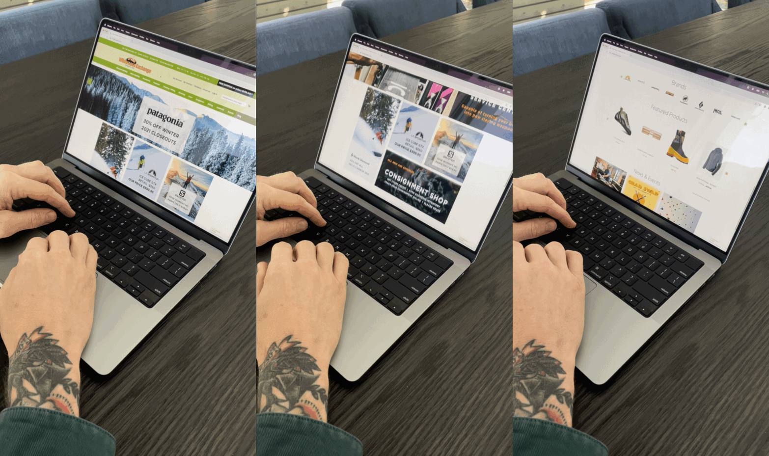
Shopping Online
Even though I shop at Wilderness Exchange it was important for me to find other Coloradans who shop there as well. Doing so would allow me to find out how the target audience uses the site to buy items.
My goal was to gather information about how they used the Wilderness site, how they felt browsing before making a purchase, how would they purchase an item and checkout, and how they felt about filtering through product pages.
WHAT ELSE IS OUT THERE?
COMPETITIVE BRANDS
Furthermore, I needed to investigate how other local and global outdoor consignment shops curated their websites. The objective with competitors was to learn what elements they use and what layout options are used to organize their homepage to influence users to purchase items. How do they utilize product filtering? How do competitors go about the checkout process?
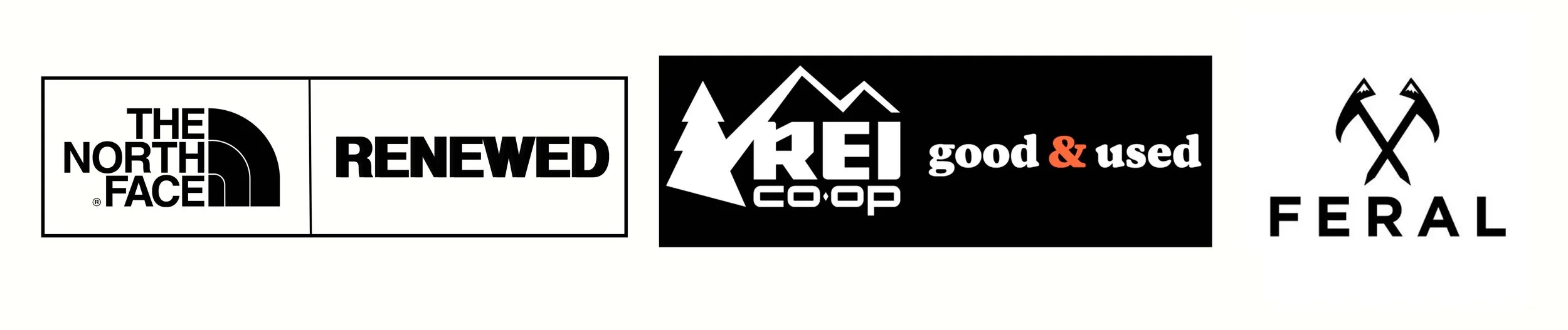
Some of the key takeaways from competitors consisted of the simplification and organization of landing pages that included a substantial amount of content being offered. I took note of how they enabled filtering through products by color, size, and availability in a matter of two to three clicks, cart pop-ups that enabled a fast check-out process, and simplified drop-down menus.
COLLECT AND MAP
After gathering all of my competitive notes and experiences with users. I kept in mind what users expressed to me not only about how they felt but how the pages of the website worked. I learned that users felt frustrated by the checkout process and found the homepage overwhelming with content and options.
“I think it’s too busy of a homepage and doesn't necessarily fit properly on a laptop, which most people are probably using at home.” - User #1
“It's a lot of information on one page, and I don't necessarily like the directional ordering to checkout.”- User #2
ANALYSIS
Reviewing the data I collected was an important yet overwhelming process since there was a great deal of information to sort through and analyze due to the research methods I used. I narrowed the user data into categories to allow myself to zero in on main issues users faced and expressed during interviews.
INSIGHTS
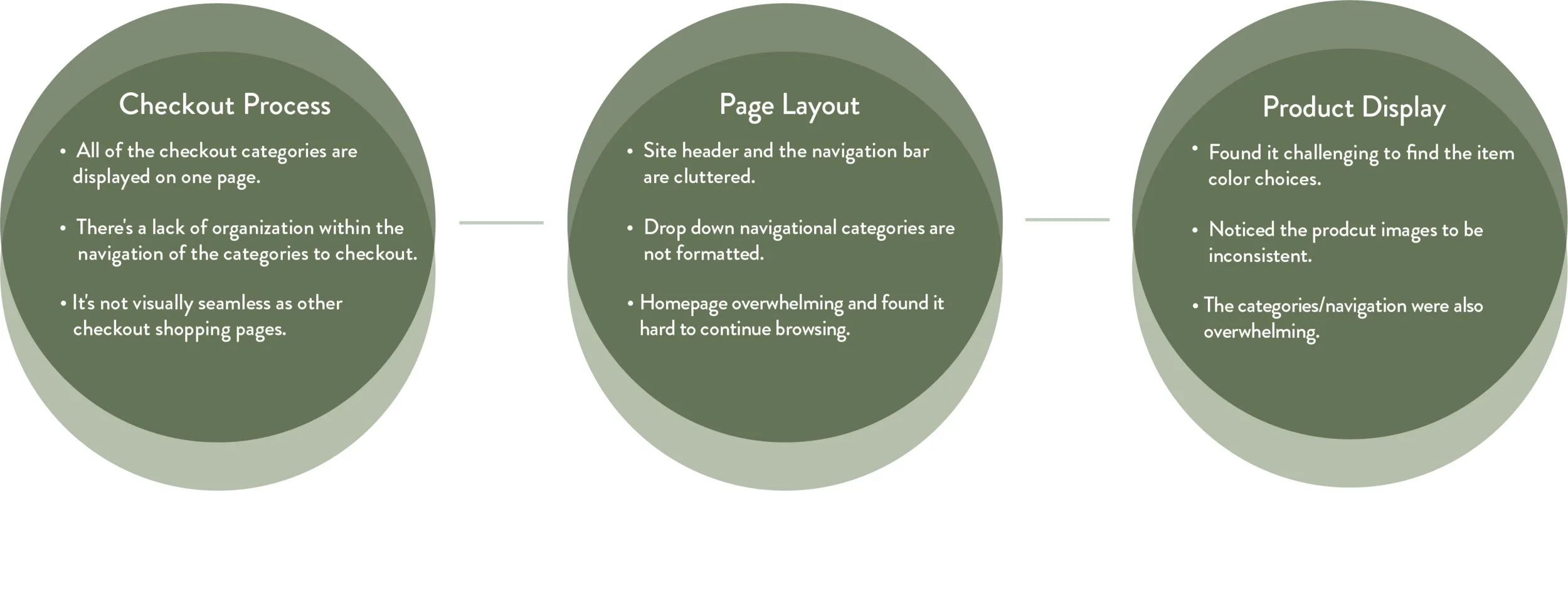
I observed that users care about the first interaction they experience on a website and how simple it is to navigate through to make purchases and browse. The layout and context of the checkout process is important and users are more likely to feel uncertain about following through with their purchase if it’s too overwhelming of an experience. Also, customers care about filtering through products to find what they want easily.
FINDING THE MAIN ISSUE BASED ON INSIGHT
THE PROBLEM
Wilderness Exchange users need a way to promptly browse and make checkout because they rather not browse through multiple pages of items to make their purchase.
Realizing the problem allowed me to create ideas that would help users navigate through the website with a sense of ease:
Simplifying the page layouts and product filters would lessen the amount of pages users click through to find a product and checkout
Improve on filtering the product page to eliminate the inability to find products quickly
Minimize the checkout options to help users finish their checkout with less hesitation
DESIGN PROCESS
“Less but, better ” - Dieter Rams
The design process was challenging since there were multiple ways to tackle the pain points users expressed while essentially rebuilding layouts that were somewhat dated. I designed around the main problem and used pain points as secondary usability features and methods.
UI DESIGN OBJECTIVES
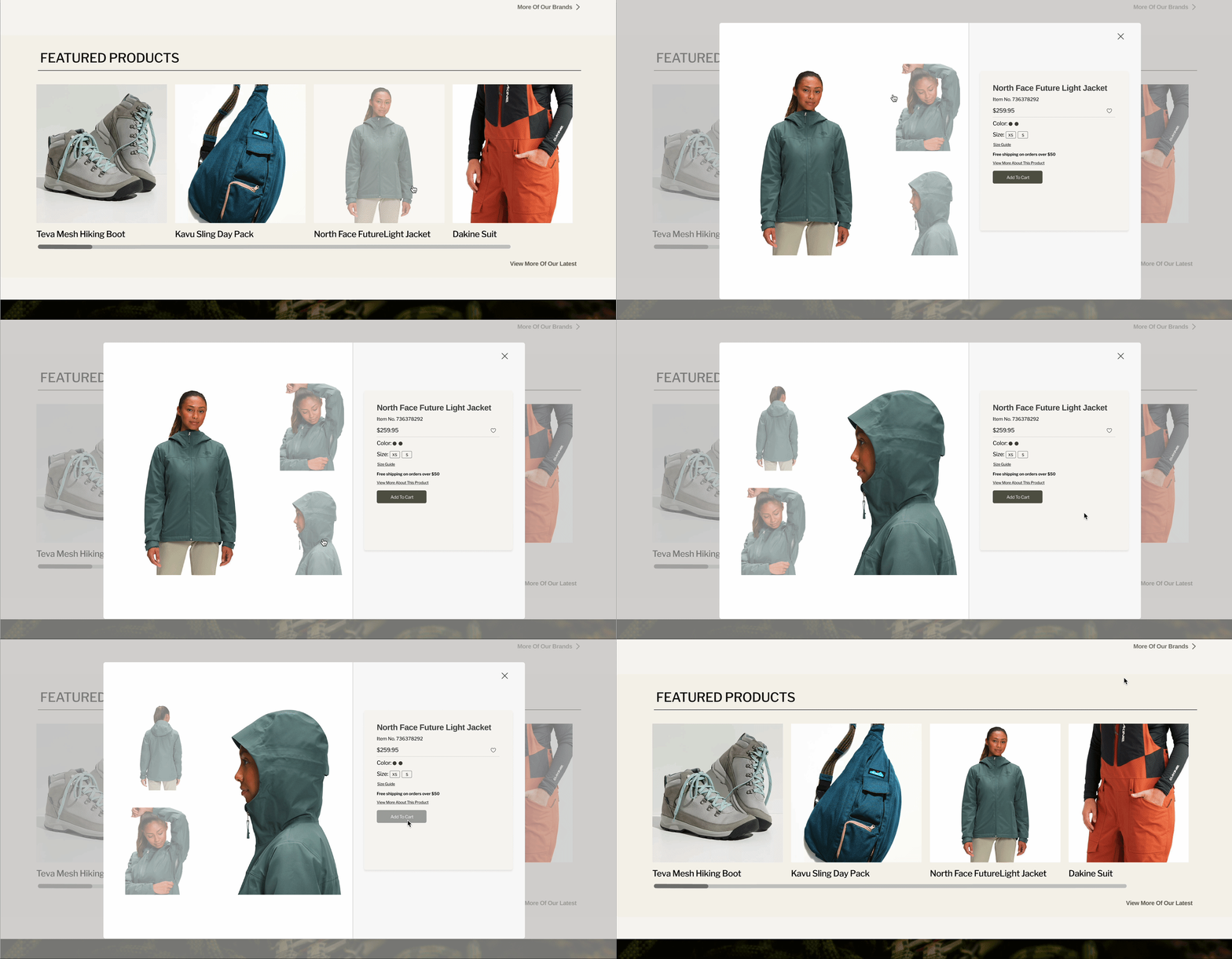
Develop a quick shop option to add items promptly to the users cart.
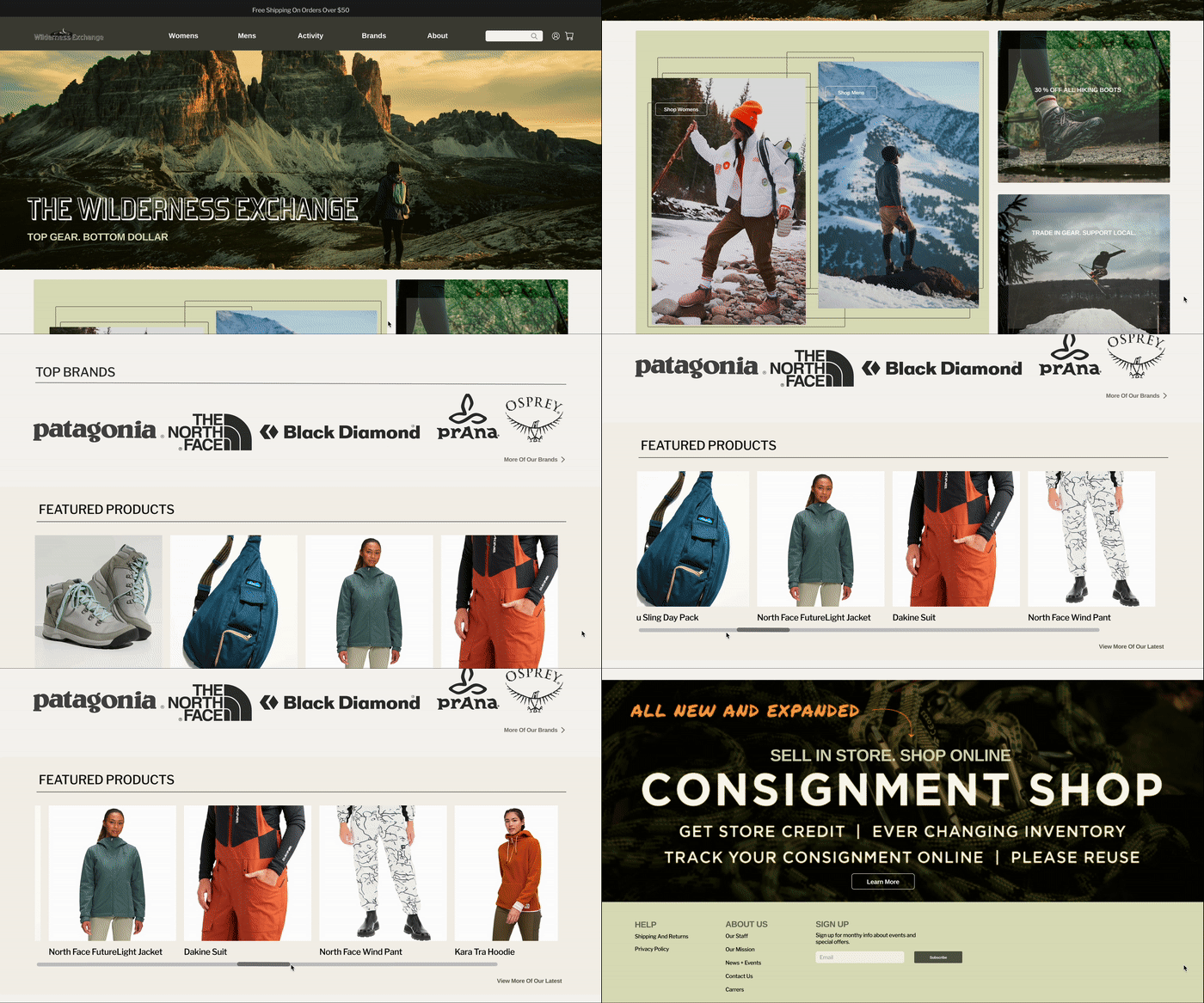
Reconstruct the homepage and reduce content.
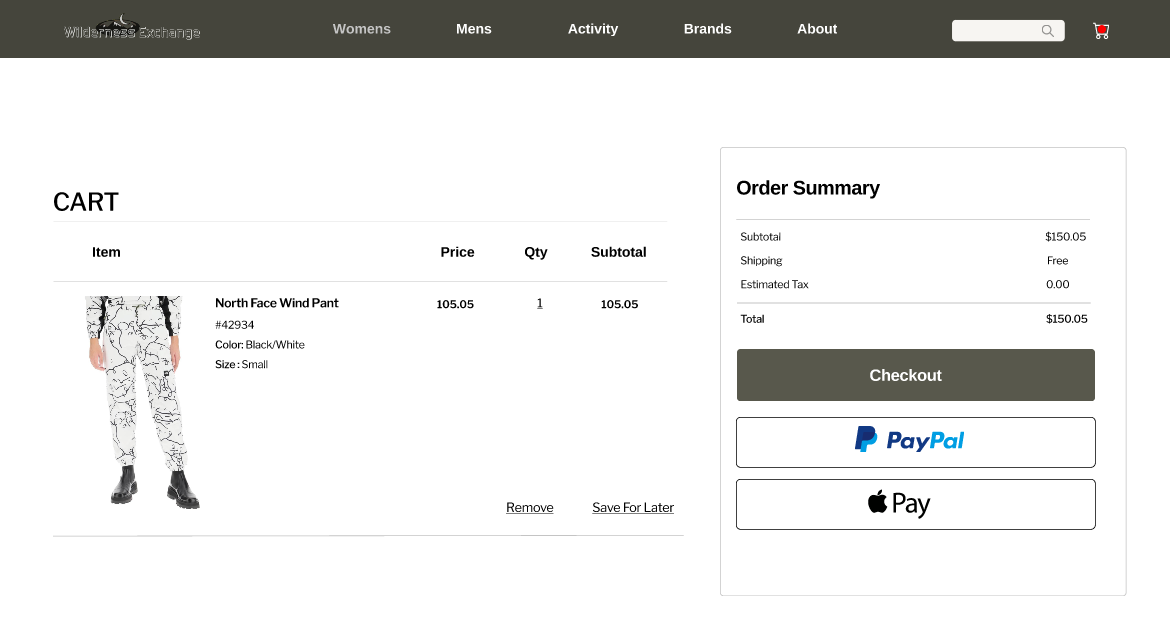
De-clutter the checkout process and make it minimal.
DESIGN ITERATIONS AFTER RECEIVING FEEDBACK
More Item Selection Options
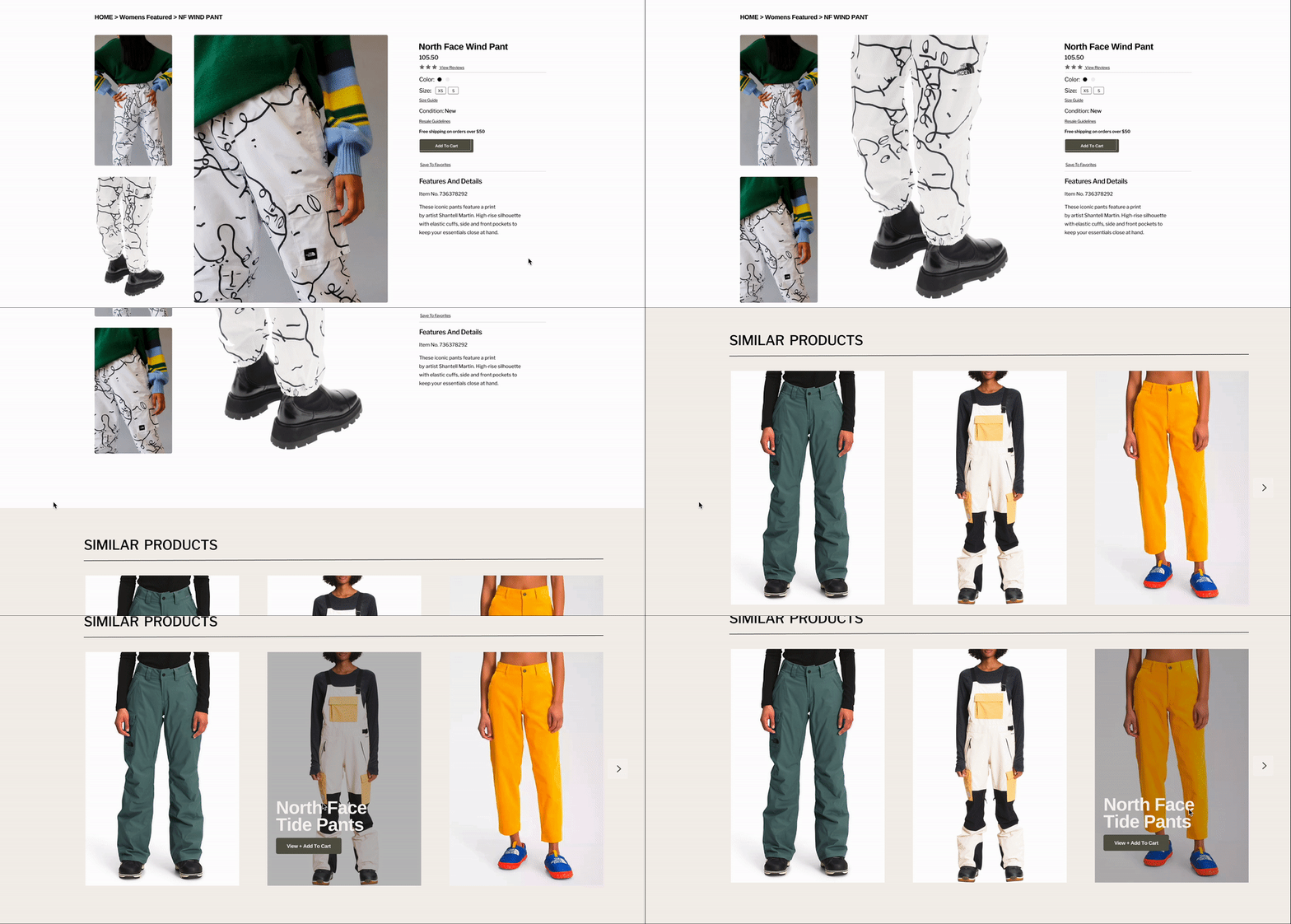
A continuous theme of product options below the main item was a method added to enable users to add more items quickly to their cart while hovering over the items with their web cursor.
Honor The Brand Identity
I was aware of how I drifted from the brand identity which took time to examine and build from without losing design context and structure. The process of adding their logo, color theme, imagery, and a similar format made the design cohesive.
DESIGN SYSTEM
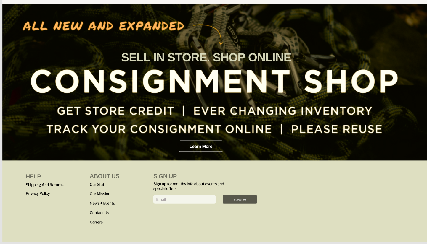
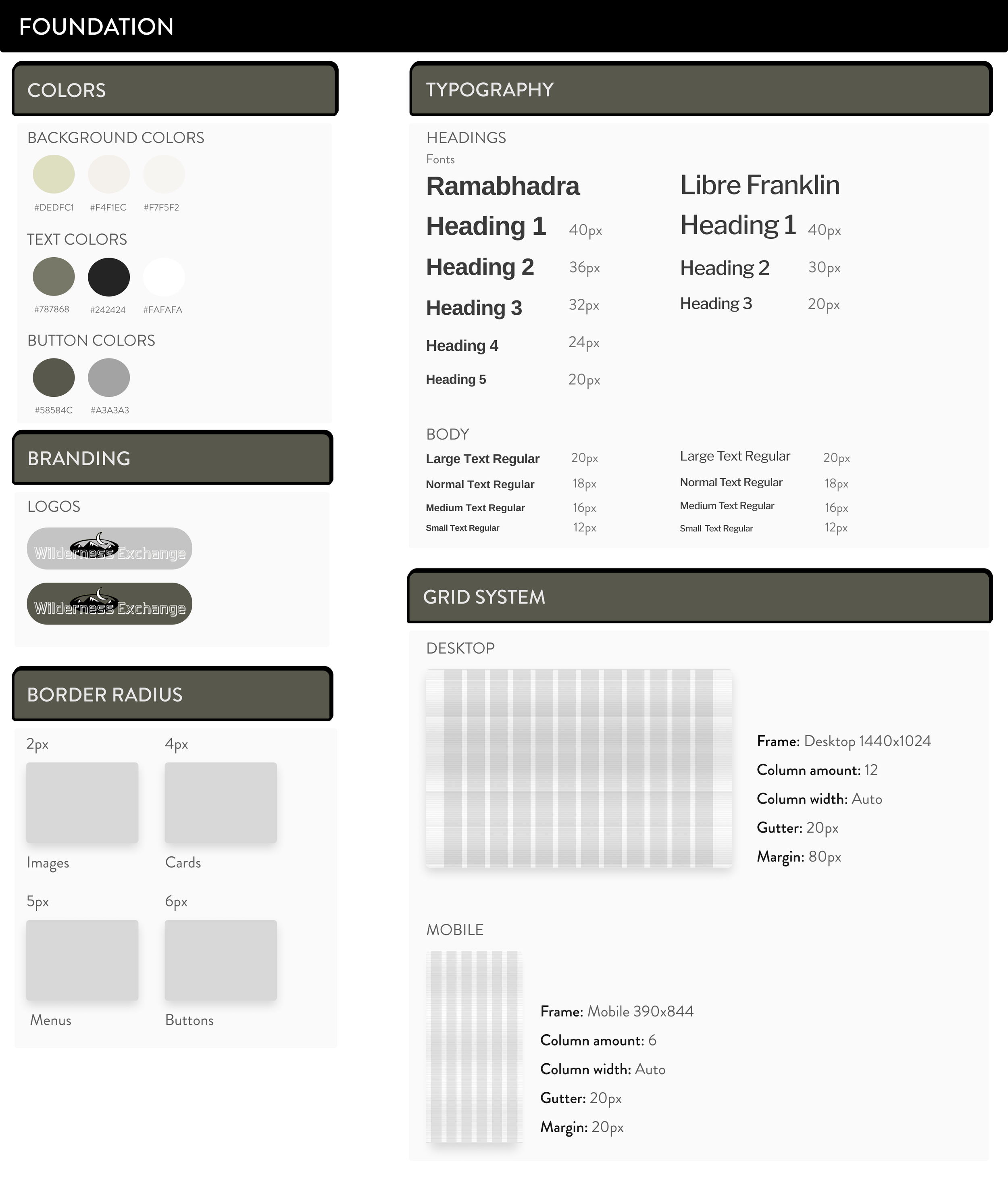
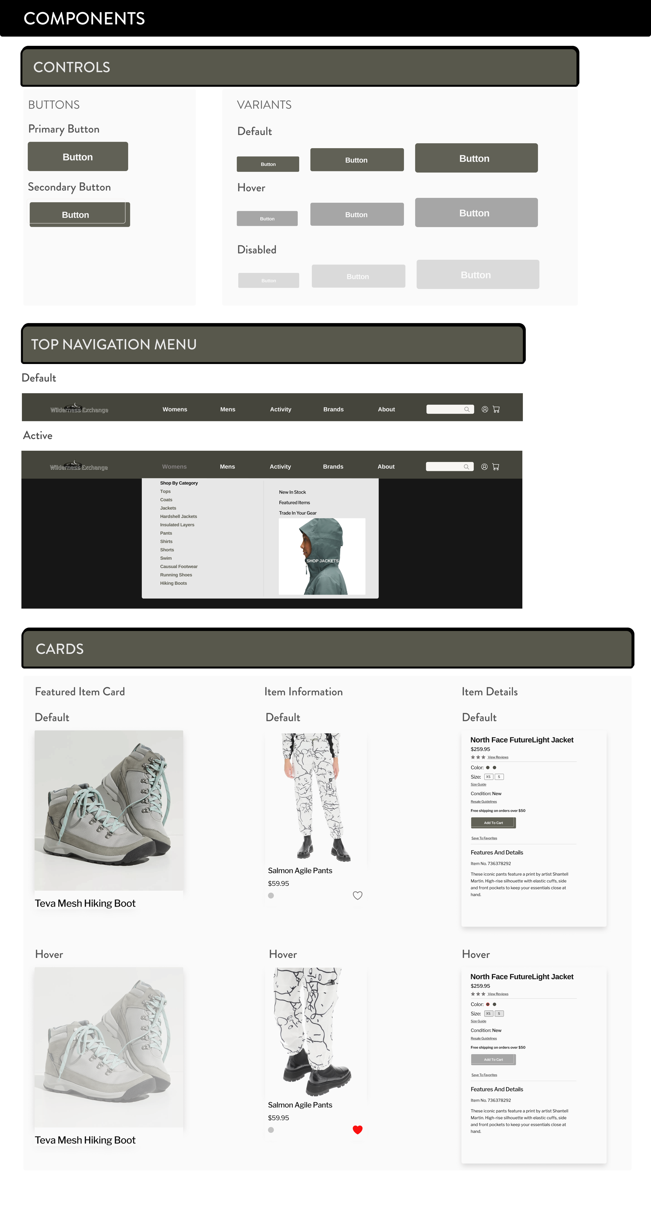
Users expressed trouble seeing images and text on the Wilderness Exchange site and disappointment in the overall quality of visuals. Choosing cleaner images, softer text, and updating the color swatches of their style while honoring brand identity was important. I did expand out of the original site design to establish a sense of modernism, similar to competitors while making iterations after feedback. In developing a style guide and design system for the redesign it was used as the source for connecting parts of the UI and prototypes.
CONCLUSION
Inward and Outward
I explored how to use different research methods to figure out what users needed within the e-commerce experience while removing personal biases of the site itself as a frequent shopper.
Iterations and constant editing was vital in understanding what I needed to hold on to and let go of within the prototyping, doing it all wasn’t an option.
If I had to do this project over I would develop more of a balance, there was a great deal of time spent in the research phase which took away from designing within the time frame provided.
This project was challenging but rewarding and drove me to continue to work through a series of iterations, feedback, and design errors.